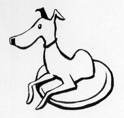
Look, we’ve got a new logo! And it’s only taken maybe three to four hours for me to learn enough CSS to figure out how to add the damn thing. Grr.
Anyway, many thanks to the lovely and multi-talented Ms. Patricia Ross, for said logo. And even more thanks to her for humoring me when I sent her back to the drawing board and said I wanted something between Pablo Picasso’s “The Dog” and this wiener dog. I think you’ll agree that she came through with flying colors. (And a great deal of politeness, especially given what artists should probably respond with when asked to ‘just draw something like a Picasso.’)
By the way, it’s an Italian Greyhound. I’m an expert, we know these things. 🙂
(Image is © Patricia Ross, used by permission. Please don’t copy it without permission.)


If I may suggest: The logo might look cleaner if you dropped it to two colors. Perhaps I’ll clean it up tonight and send you a copy.
VERY cool new logo! Nice, simple lines, and a charming mascot. I can imagine this looking very sharp on a die-cut bumper sticker.
Thanks! Yeah, Rossi’s great. Check out her blog sometime… the top post in it is the animation of an accidentally recorded conversation in a pub, between a couple friends of Autumn’s.